BONA
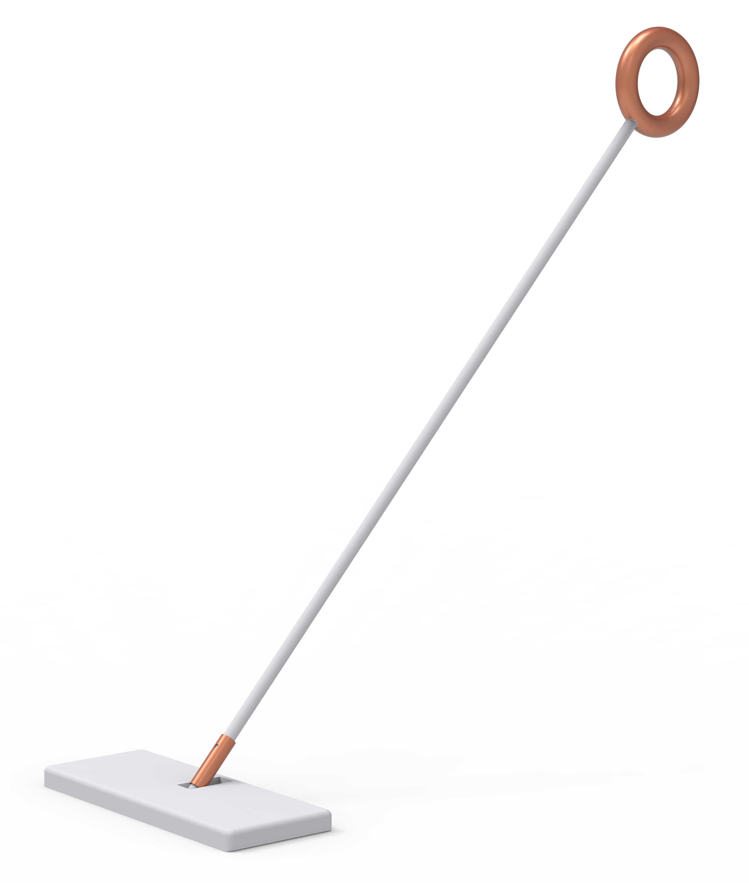
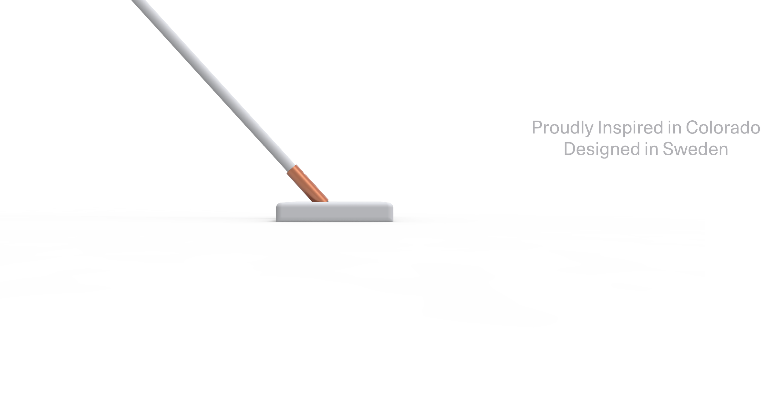
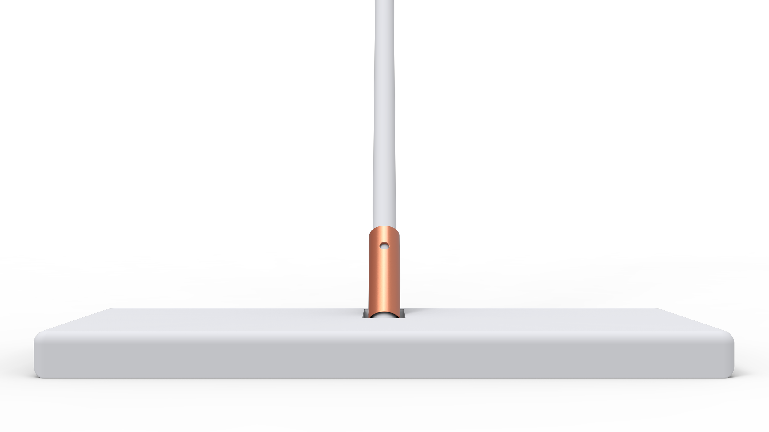
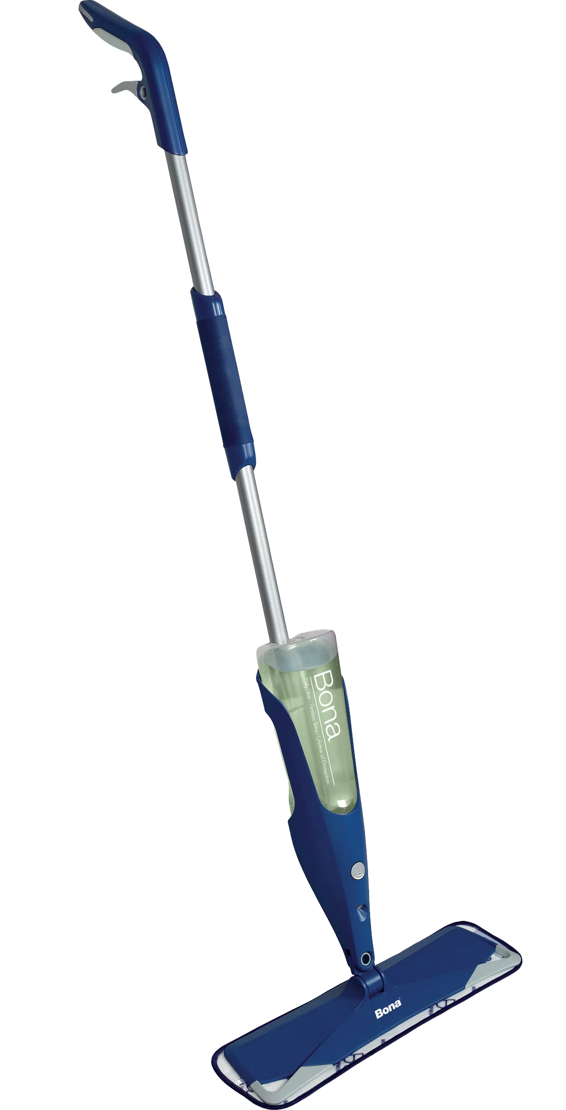
Sweden has a brand, a very specific design language. The current mop didn’t reflect that; far from it. By studying Scandinavian Design, the product took on simple geometric shapes. This clean feel exuded the feeling of premium of which, studies showed, that people are willing to pay a bit more for. We reduced the BOM while we were at it, greatly reducing the cost of tooling.



Package Redesign:
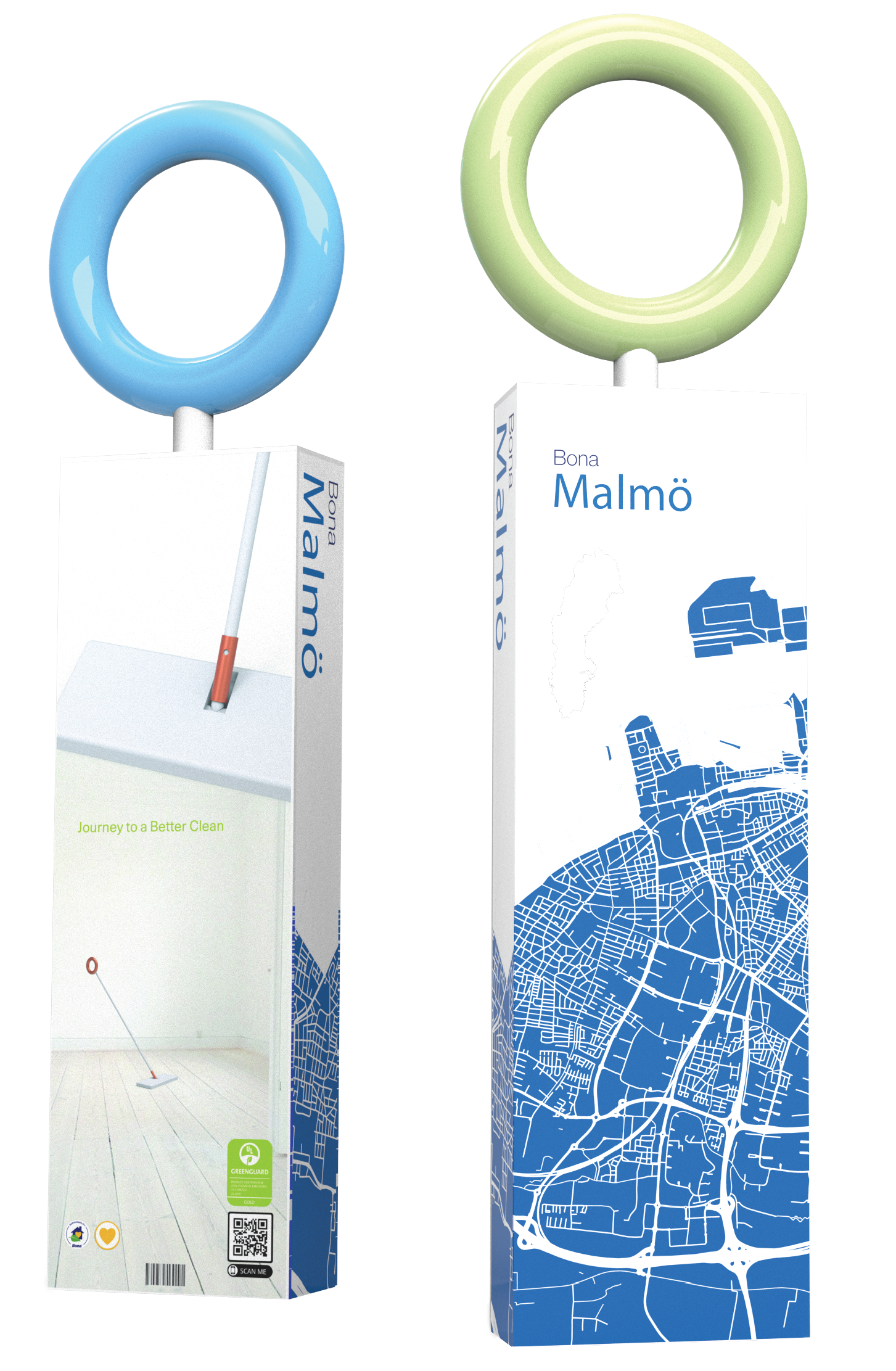
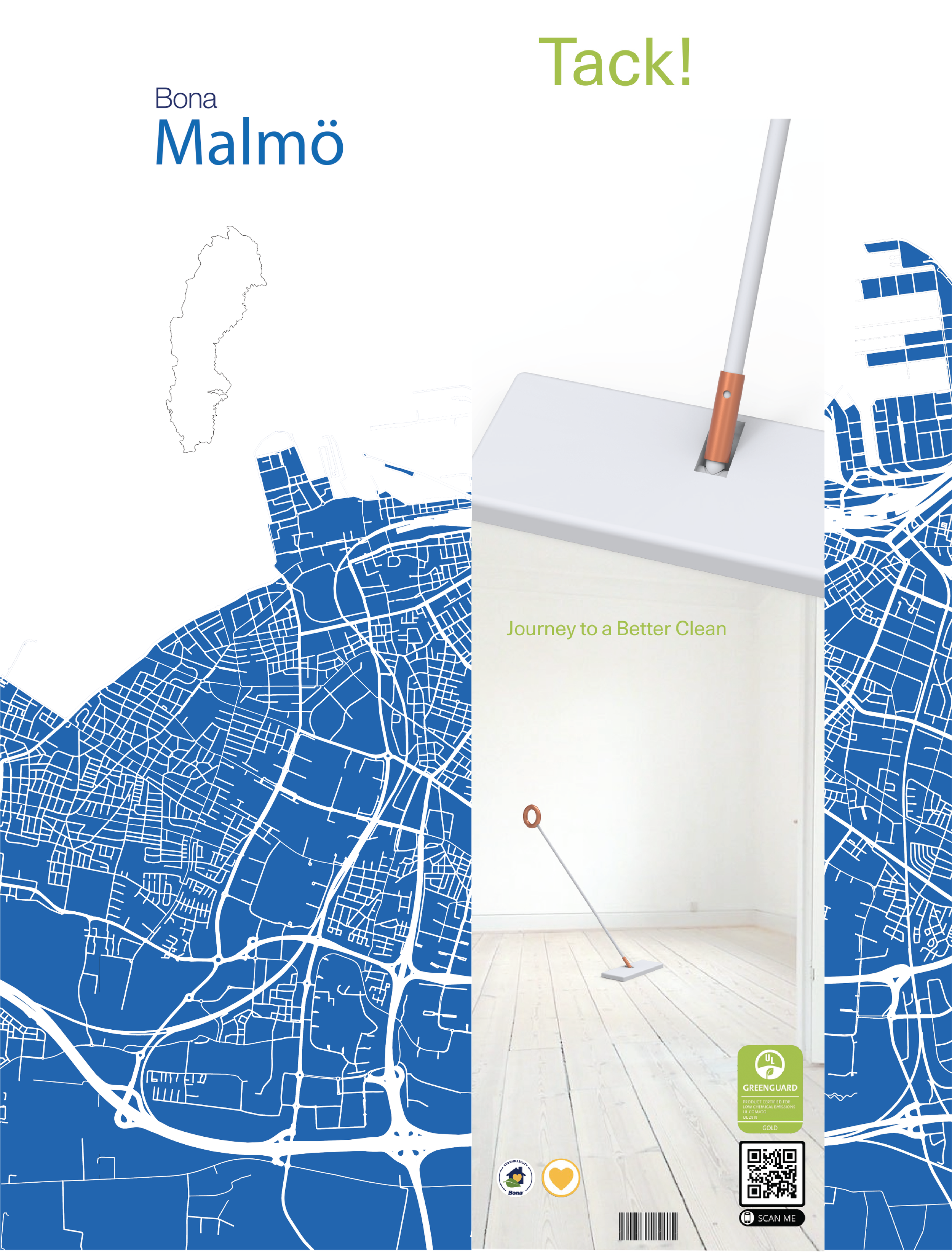
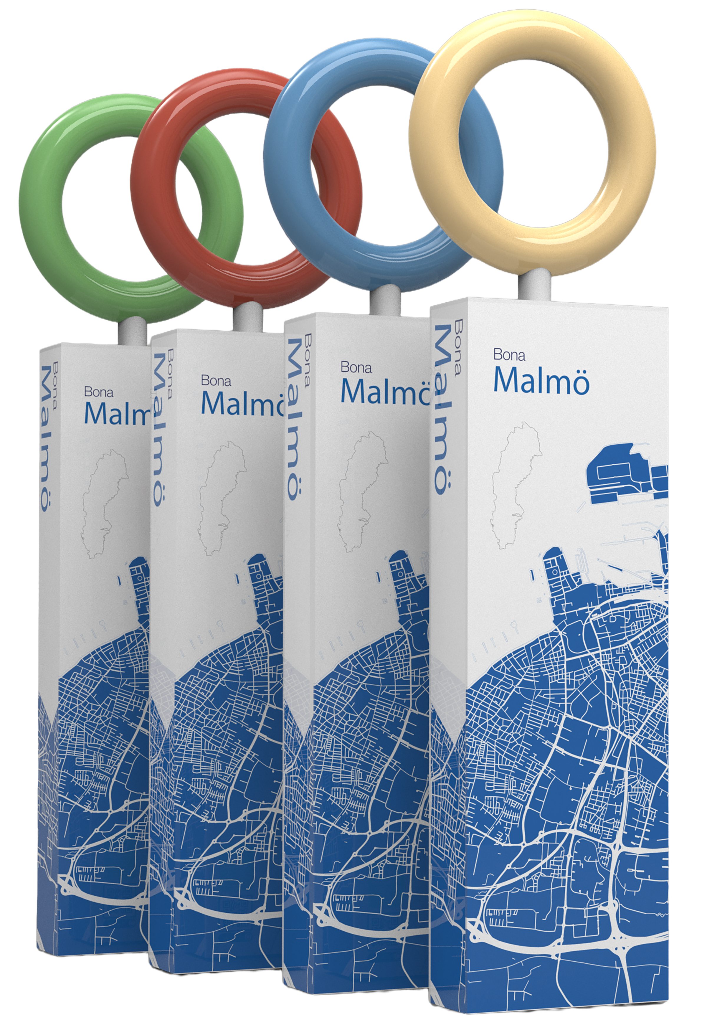
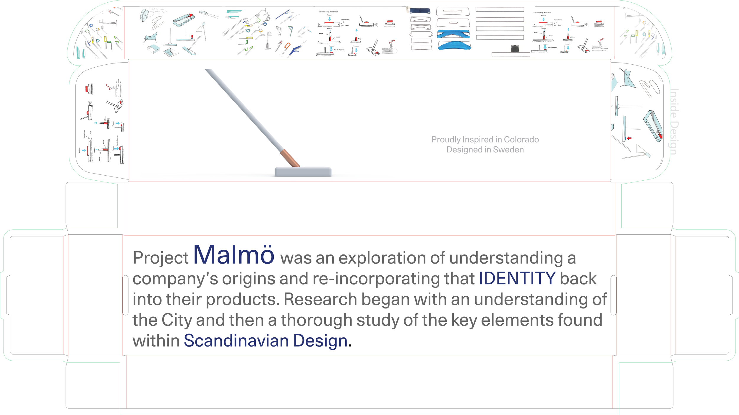
Celebrating Malmo, the hometime in which Bona was founded. Overlaying the map of the city onto the box, with the handle used as a means to hang in the store. Designed to work with existing attachments.